Customer satisfaction has always been an important contributing factor to businesses and more recently, it has been translated to technology too! No longer it is sufficient for businesses to ensure customer satisfaction offline, but on online platforms too.
The Reason
It is okay to place your contact number on a website 10 years ago (if you had one) and expect customers to call you directly should there face any problems. In fact, your website did not need to be interactive. A guestbook (do you remember that one) was the cool thing back then.
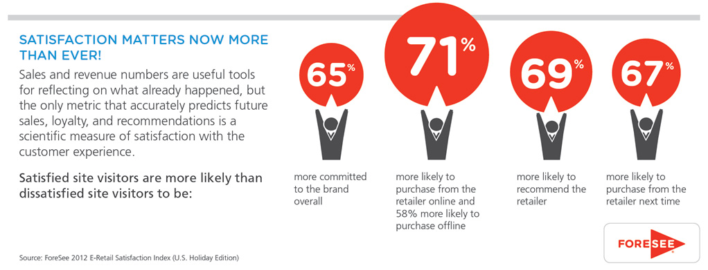
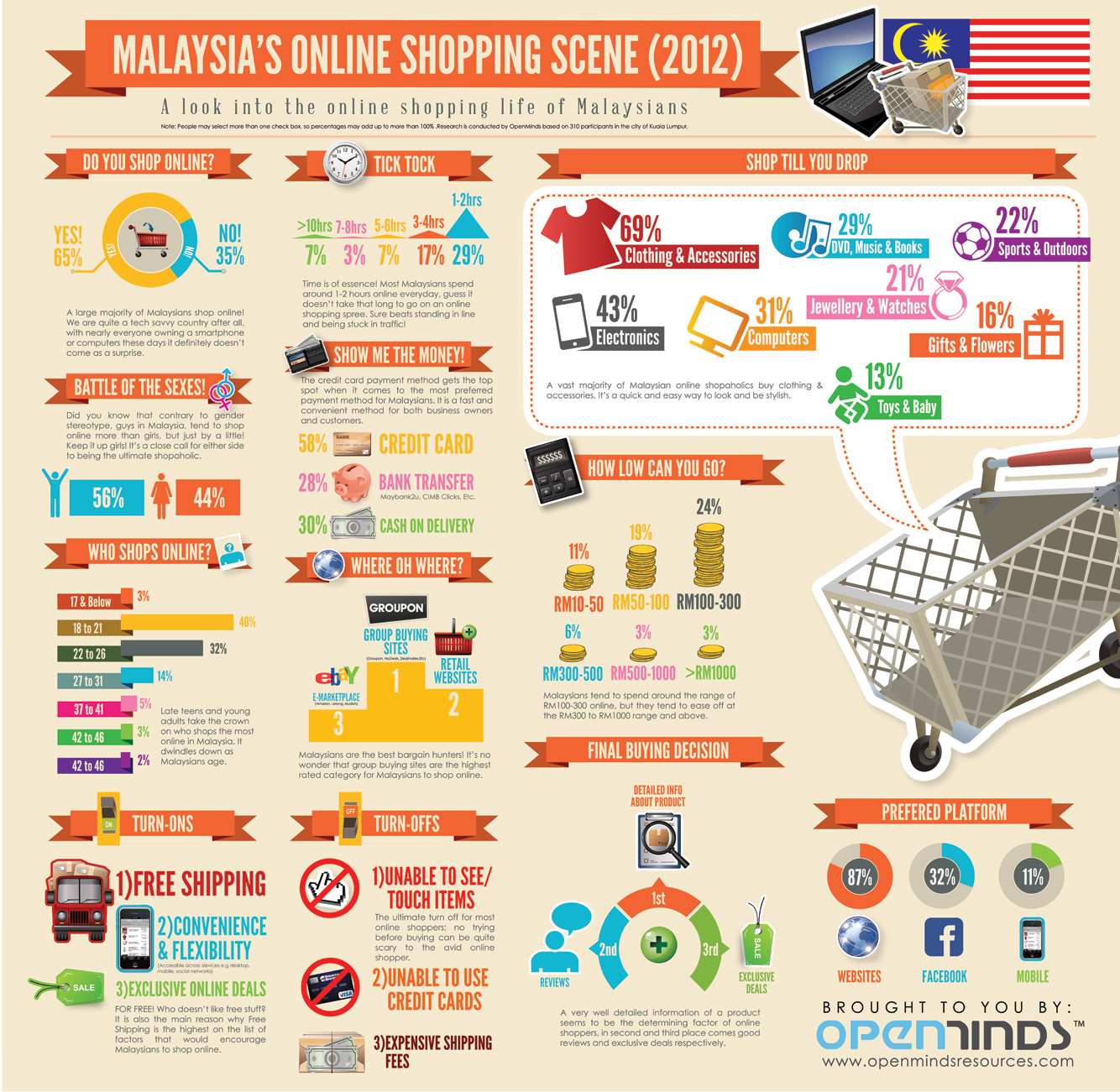
Today, things are different. There was never a time more relevant than now for you to ensure a higher customer satisfaction rating on your online platforms. A recent survey revealed huge numbers on online customer satisfaction and how it CAN indeed improve sales – both offline and online (click on below image for full article).
The Challenge
You may have seen or read tons of reports, articles, infographics such as the above and you know by heart how customer satisfaction is important. The problem is, how?
- How can you effectively increase customer satisfaction through your website?
- What can you do to ensure customers have a good digital experience with your brand?
- What does it take to be ‘user friendly’?
- What is ‘user friendly’ anyway?
If you’ve asked some of these questions above, read on!
10 Ways To Increase Customer Satisfaction Online
#1: Provide REAL Product Reviews and Ratings
Note that I stressed on the word ‘real’. Simply placing a photo of a satisfied client with a well scripted message does not cut it anymore. Allow customers to generate their own reviews, both good and bad. Empower your customers to create more customers. Let customers see for themselves what others are talking about your product or service and allow them to speak of their experiences as well.
#2: Clear Navigation (and Call-to-Action!)
Ever been to websites that plays hide-and-seek with you? Hidden links, poorly coordinated colours or simply just by having too many links. Contrary to the beliefs of many businesses, having more links does not necessarily help customers to navigate better.
Ask yourself, who do you expect to come by your website? What do they expect to see? 3 different links to you company’s vision and mission statements or the products and services you offer? Are they often looking for an answer to a question or to get personal advice from you?
#3: Support
Let’s be honest here, there are many occasions where we as customers ourselves often head straight to the contact form to pen down our feedback, suggestion, enquiry or question without first checking the FAQ page or using whatever search feature there is. While sometimes it is due to customers being hasty, often it is due to you not providing clear or simplified ways for them to seek support from.

Let’s take a look at Air Asia for a bit. Note that they have a section on their website solely dedicated to answering customers’ questions? Not only they provided a clear and distinctive way of searching, the topics are also laid out in a very understandable manner, minus the jargons.
#4: Be Multi-Channel
Provide as many avenues for customers to be in touch with you as possible within your capabilities. This not only allows customers to communicate on what they are comfortable on, but it also demonstrates how open you are to hear from your customers.
I usually recommend my clients to have a minimum of 3 different customer touch points: a contact form via the website, a contact number and a social media platform. While these touch points are not absolute, it caters to 3 different groups of customers – the tech inclined (contact form), the non-tech inclined (contact number), and the socialites (social media platform).
#5: Surprise Them
Think about the small things that can make a difference, just as how awesome it would be for a hotel to leave you a handwritten note during your check-in or how the waiter brings your check with free mints. How can you convert these small gestures online?
It does not need to be something big but good enough that it stands out, especially from your competitors. It can be a small bonus, extended warranties, free support or training, insider discount, an easy return process or even personalized packaging (I’m a sucker for packaging)!
#6: Don’t be Too Quick to Reply
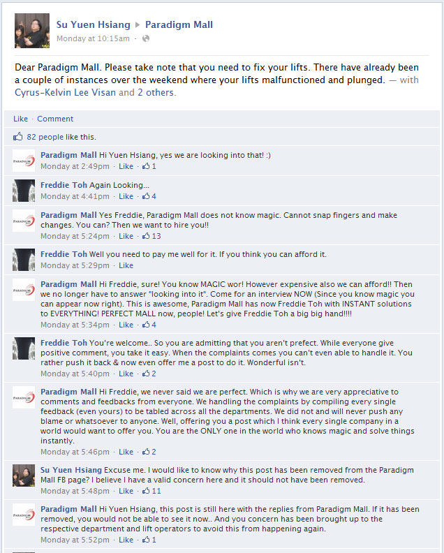
Businesses often equate speed or response time to customer satisfaction. That’s just partially true. There’s nothing more irritable than receiving a half-baked reply that derails from the customer’s concerns. Customers want their voices heard and problems acknowledged. Saying “We will look into it” is not enough, especially if it s a canned response.
Your response does not need to be Lego, but relate yourself in that very same situation, address the pain and always offer a solution. If there is none, tell the customer what will be done exactly on your end to rectify the problem. Take it another step further by dropping the customer a call or another email few days later to provide an update of the situation.
#7: Mobile Compatibility
You’ve probably heard this a million times and I’ll say it again because it IS that important. With such a huge increase of mobile users over the past 3 years, it is almost guaranteed that customers will likely stumble upon your site on their mobile devices – whether it’s through a link on Facebook, a newsletter you’ve sent or via search engines.
A site that is mobile compatible usually has these traits:
- NOT designed using Flash
- The site fits into the screen
- The contents, such as text and images can be seen without scrolling or zooming
- Simplified navigation scheme (e.g. displayed in a dropdown list instead)
- Quick loading time
#8: Check Your Links
This sounds like an easy one but you’ll be surprised on how easy it is for you to miss just a single link on your website. Click here for an example.
See what I mean? Did that annoy you just a bit? Check your links. All of them. Make sure they work as intended as customers do get annoyed if they can’t get to where they want to be!
#9: Revisit Your ‘Introduction’ Page
There really is no reason to put a page before your home page. I am very glad that this trend is slowly making its exit but many businesses are still on it! If you have one, do you REALLY need to have one? Can that introduction be placed as part of the home page instead?
Such pages not only requires customers to go through an additional step to ‘enter’ or to ‘skip’ it, it is bad for SEO too. Search engines hate it, and you definitely do not want to get into their bad books!
#10: Loading Speed
One of the biggest turn offs is slow loading speed. Not only it greatly affects browsing experience, it totally kills the mood too. No customer would be happy waiting for your product page to load or to make a payment. Did you know that even a second is now, too long?
Google has a nifty tool to test your website’s speed and recommends ways you can speed it up, though you need a technical person to do so. If your website is getting anything lower than a score of 60, you definitely need to do something about it!
Customer Satisfaction is Here to Stay
Like it or not, customers will continue to expect more out of businesses online especially when the internet population and tech literacy continues to increase. Business can no longer escape this fact, not for long.
Remember, dissatisfied customers can stir a storm and should not be taken lightly.
What’s your take on customer satisfaction online? What is it that ticks you off the most?









 + Keep your head in the game and focus on what’s most important for your business.