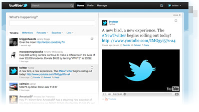
There’s A New Bird in Town! #NewTwitter
Just hours ago, Twitter introduced a new design for Twitter.com to provide a better user experience. I think most of us can testify that the older version lacked luster, causing many to use 3rd party apps / sites to make tweeting a simpler thing to do.
This new version now runs on a dynamic two-paned format and to me, it feels like browsing on an iPad.. with a mouse, that is. The first pane contains the Twitter timeline, basically what you’re already seeing today. The second pane is what makes things different as users will now be able to see additional details related to the author or the tweet, the user profile, @replies and you’ll also be able to view images, maps and videos directly from Twitter itself without leaving the page, giving less reason for users to leave the site, going into YouTube, TwitPic and the likes!
To me, this is definitely a smart yet long delayed implementation since almost everyone shares media over Twitter although 1 of my favourite function still hasn’t been implemented yet – ‘conversations’ i.e. grouping @replies together under 1 conversation for easier reading, just like how Gmail does it. Nevertheless, it is interesting though, to see how mere 140 characters can evolve to how it is today.
And oh, the promotional video for the #NewTwitter is also pretty cool! I like how they did it – illustrating the concept of sharing through Twitter AND the new design of Twtter.com. Very well done!
So here it is, the #NewTwitter! Simply head over to Twitter.com and log in to see the newly updated changes! If you do not see it, don’t worry as it will eventually come as they’ll be doing a progressive update worldwide. If you’re wondering what the changes actually are, you can also check out the new specs over here!


