3 Simple Steps to Create Your Custom #newtwitter Background
I don’t know about you but I was one of those caught in the transition phase from the old to the new Twitter. I was in the midst of designing my own custom background days before the #newtwitter launched and my effort went to waste since the measurements are completely different from before. What’s sad was I did not have the #newtwitter until a couple of days back in which I could finally proceed with designing again.

After some trial and error, I managed to get the measurements right and to my dismay (and many others too), the #newtwitter has very little sides to play with. Nevertheless, the below are steps on how you can create your very own custom #newtwitter background – the easy way in only 3 simple steps!
1. Determine Screen Size /Resolution
I would strongly recommend 1280px x 1050px as most people have this to date but this is entirely up to you. Anything lower is a no-no.
Note that I’ve purposely enlarged the resolution to 1050px instead of 800px as you may want the background to be fully covered even on non-widescreen monitors. 1680px x 1050px is the next most popular resolution.
2. Start Designing
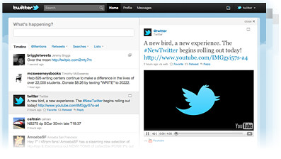
![]() This is perhaps the most time consuming part of the entire process as you will need to get your designs filling the space around the Twitter timeline. The good news is that if you’re using Photoshop, you are able to use this template that I’ve created (and used) at no cost! Simply download it and change the background accordingly and you’re all set to go!
This is perhaps the most time consuming part of the entire process as you will need to get your designs filling the space around the Twitter timeline. The good news is that if you’re using Photoshop, you are able to use this template that I’ve created (and used) at no cost! Simply download it and change the background accordingly and you’re all set to go!
3. Save, Upload and Test it out
Simply save your masterpiece as a JPEG / PNG file, upload it to Twitter under “Settings > Design” and you’re done! If you are wondering how would your background look like on different monitor resolutions, I used this really convenient Chrome Extension to do the job for me without having to change the monitor resolutions manually on Windows. It simply allows you to switch between different sizes on the browser window itself!
Note: if you’re using the template, remember to remove the Twitter timeline before saving it into jpg / png
You’re Done!
That wasn’t too difficult, was it? Check out my Twitter page to see what I did. I would also love to see what you came out with!
Do leave your links and I’ll definitely drop by. Have fun designing! :)

A great looking Twitter page. You did a fantastic job! I need to get back and redo mine. I redid mine on day 1 of the new Twitter format and haven’t found the time to get back and make some needed changes.
Another great post!
Hey Amy, thank you! I think yours is good, too! Simple, clean and gets the necessary information across very well. Do let me know if you do make changes and I’ll definitely drop by to have a look.
Jan,
Your twitter background is great thank you for this much needed information. I am going to start designing my new background today.
xoxo
keep up the good work
~Jessica
Hi Jessica, thanks so much! Glad the article helped. The attached template should be able to speed up your designing process, too! Do let me know when you’re done so that I can swing by to have a look. Looking forward to it! :)
I set out to do it and I got side tracked I will work on it in the morning xoxo
Jess
Haha things do catch up on us sometimes so it’s all good! Hope it will be up soon!
Jan,
So true! I just up loaded the new BG for twitter: ) go check it out bug thank you for the template you made it much easier.
http://twitter.com/#!/FindingOnesWay
Wow, your background is looking good Jessica! You made use of the transparent-ish part very well! Glad the template came into handy :)
Newly done custom backgrounds always gives a fresh look to the page. The best part to is that you can be sure no one else has the same! Now I hope Twitter does not change their layout anytime soon again haha..